August 18, 2026
Your Website Has 50 Milliseconds to Make a First Impression
By Theresa Kluk
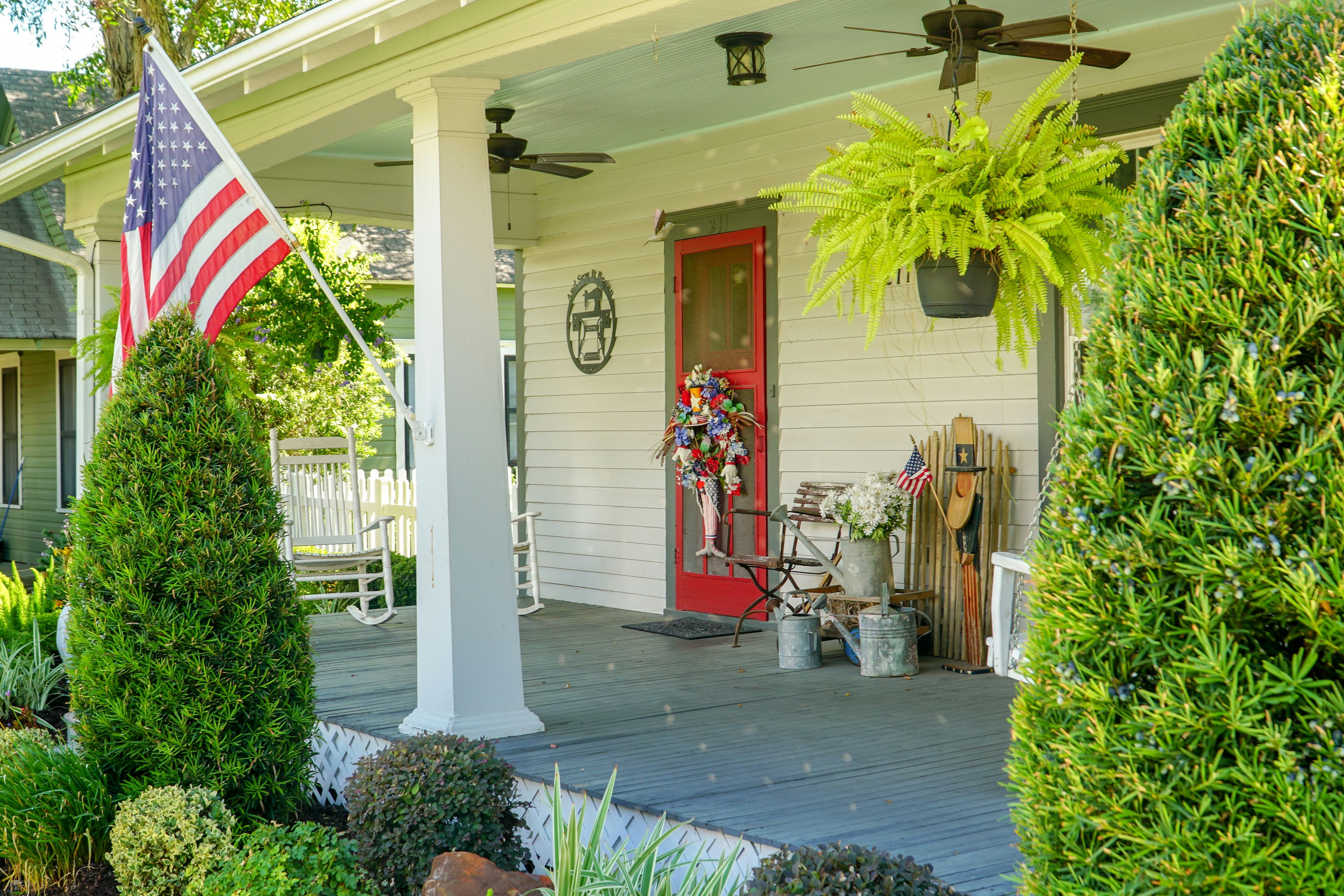
Think about the last time you walked into someone's home for the first time.
You knew almost instantly how you felt. Not because anyone said anything, and not because you'd taken inventory of the furniture. You just knew — whether you were welcome, whether you could relax, whether these were people who'd been expecting you.
Your website does the same thing. It just does it faster than you'd believe.
Fifty milliseconds
There's a well-known study by Gitte Lindgaard and colleagues, published in Behaviour & Information Technology, that gets cited constantly in the design world. Researchers showed people web pages for extremely short flashes of time and asked them to rate the visual appeal. Then they cut the exposure time down to fifty milliseconds — five hundredths of a second — and the ratings held steady.
In other words, people form an opinion about a website in less time than it takes to blink. And according to the Nielsen Norman Group, that snap judgment about aesthetics rarely changes even when people are given more time to look.
Read that again, because it's the part that matters: the first impression tends to stick.
Why this isn't as shallow as it sounds
The instinct is to be a little offended by this. Shouldn't people judge a business by the quality of its work, not by how its homepage looks?
Sure. But that's not really what's happening.
What visitors are reading in those first milliseconds isn't "is this pretty." It's "does this feel cared for." A cluttered, outdated, slow-loading site sends a signal — fairly or not — that the business behind it might be cluttered, outdated, and slow too. A clean, clear, thoughtfully built site says someone paid attention here.
That's not vanity. That's evidence.
And here's the encouraging part: Nielsen Norman Group's research has consistently found that while design trends change constantly, human behavior doesn't. What makes people trust a website is remarkably stable over time. You're not chasing a moving target. You're doing a few fundamental things well.
What visitors are actually looking for
Once that instant impression is made, people start scanning — and they're fast. Nielsen Norman Group's eye-tracking work documented what's called the F-pattern: eyes sweep across the top of the page, then drop down the left side. Anything buried in the bottom right or at the end of a long paragraph tends to get missed entirely. Their research also found that the majority of viewing time happens above the fold, before anyone scrolls.
So the top of your homepage is carrying almost the entire weight of the first impression. In that space, a first-time visitor should be able to answer three questions without scrolling and without thinking hard:
- What is this business?
- Is it for someone like me?
- What do I do next?
If your homepage doesn't answer those three things clearly, no amount of beautiful photography will save it.
A test you can run tonight

Here's something you can do in ten minutes, for free.
Pull up your homepage on a phone. Show it to someone who's never seen it — a friend, a neighbor, someone at church. Let them look for five seconds, then close the screen.
Then ask them: What does this business do? Who is it for? What did they want you to do?
If they can't answer, you've found your problem. And it's almost always fixable — usually by removing things rather than adding them. Fewer competing messages. One clear headline. One obvious button. A photo that's actually yours instead of a stock image three competitors are also using.
Most of the homepages we redesign don't need more. They need less, arranged better.
The front porch
We keep coming back to hospitality when we talk about this at Yellowhammer, because we think that's genuinely what's going on.
Scripture takes hospitality seriously — "practice hospitality" isn't a suggestion tucked in a footnote, and Hebrews reminds us we may be entertaining angels without knowing it. The whole idea is that how you receive someone before you know anything about them says something true about your heart.
Your website is your front porch now. It's where people arrive before they ever meet you, often at 10pm when they're comparing three businesses and deciding which one to call in the morning. You don't get to greet them at the door. The page has to do it for you.
So the question isn't really "does my website look modern." It's "does my website welcome people well?" Is it clear? Is it honest? Does it load quickly enough to respect someone's time? Does it make it easy to reach a real human being?
That's not marketing strategy. That's just treating people the way you'd want to be treated — which happens to be the oldest advice there is, and still the best.
If you're not sure how yours holds up
We'd be glad to look at it with you. No pressure and no jargon — just an honest read on what a first-time visitor sees in those first few seconds, and what would actually make a difference.
Sometimes it's a full redesign. Often it's three small changes. We'll tell you the truth either way.
Yellowhammer Studios is a mother-daughter creative studio in Huntsville, AL, specializing in website design, branding, and social media — made with craft and intention. Always.